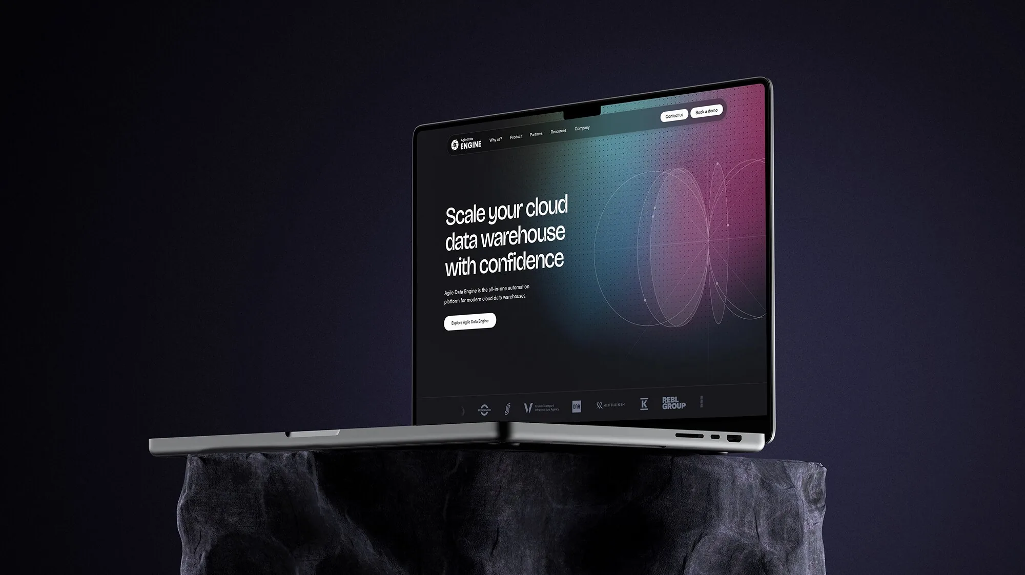
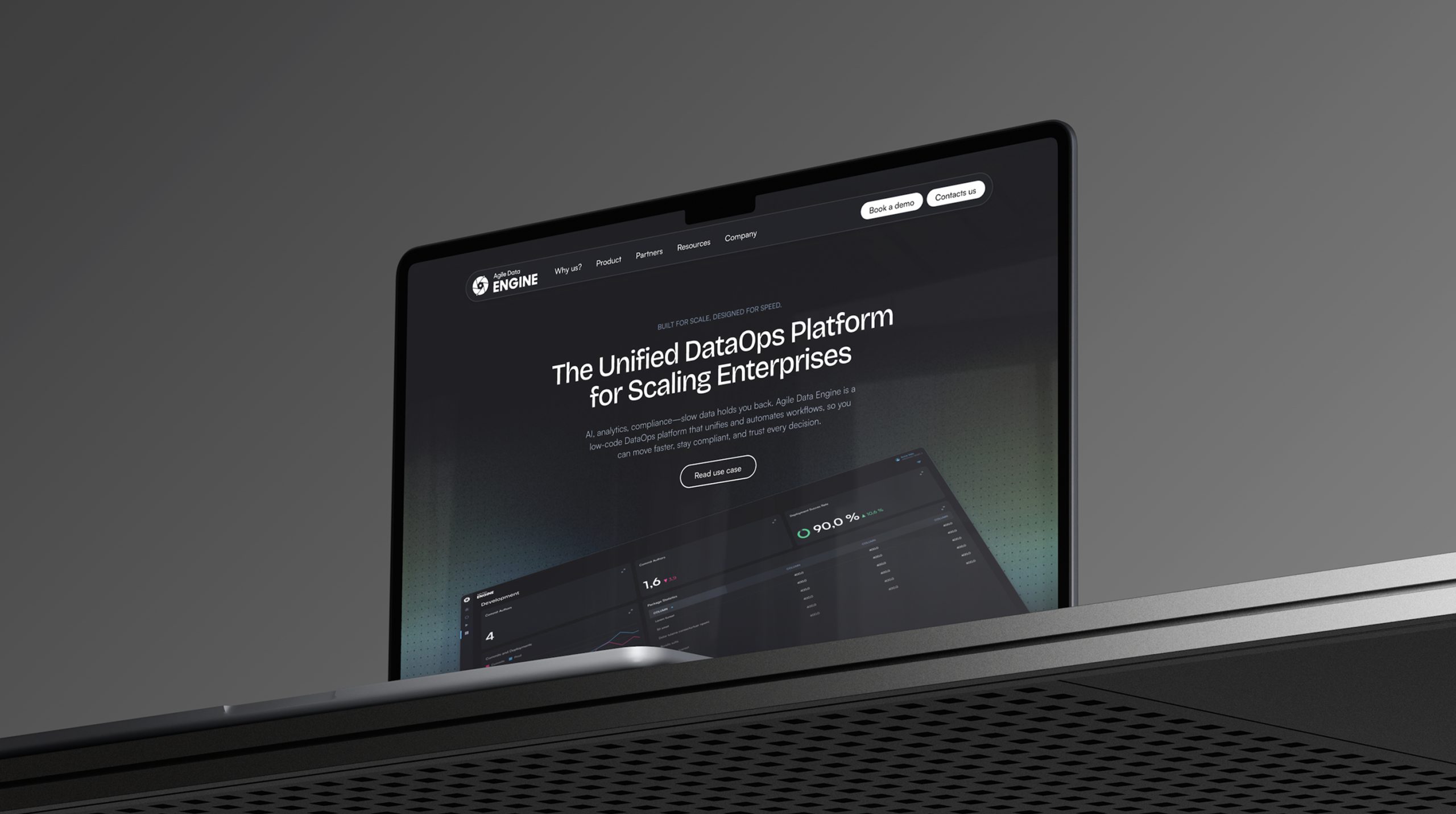
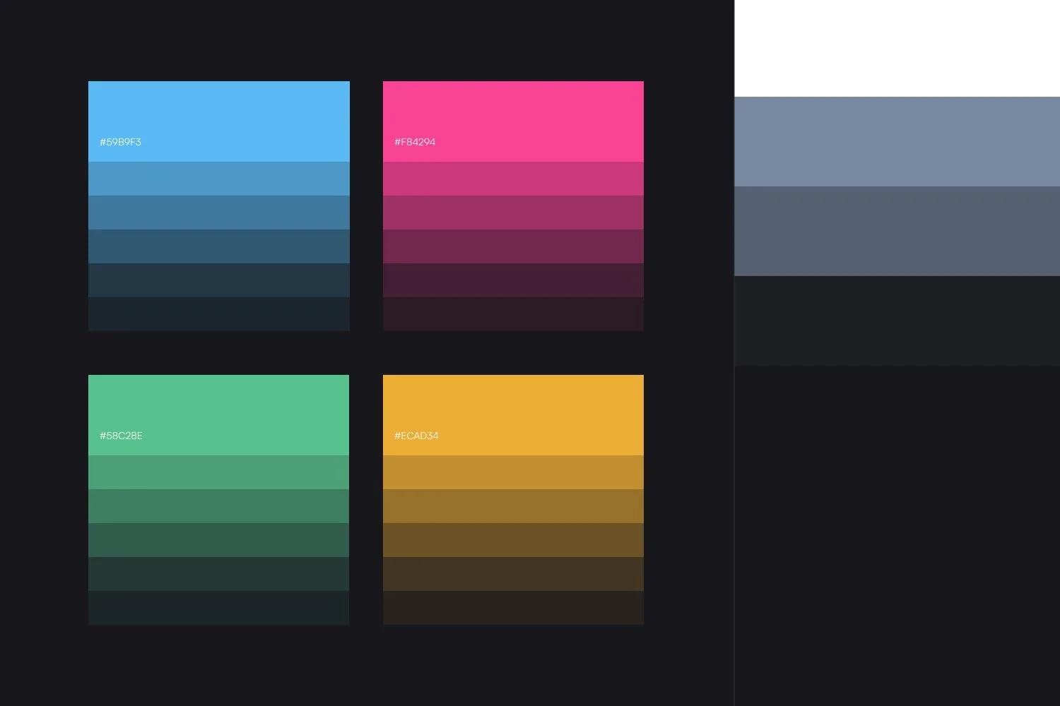
Agile Data Engine is the all-in-one automation platform for modern cloud data warehouses. We helped them update parts of their brand and build a whole new website, while keeping key parts of the existing identity such as the logotype and colours.
Go to live website ↗Process
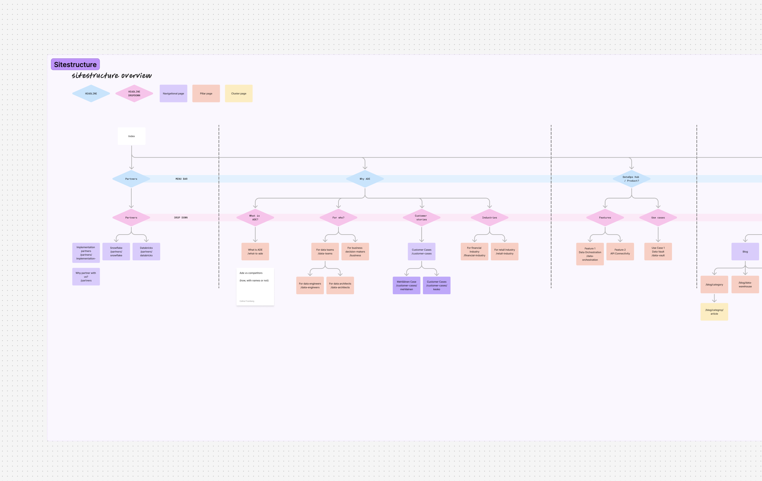
Agile Data Engine is based in Helsinki, so we travelled over for two full days of workshops to really understand their SaaS platform and its different products. Together we defined the target groups and a clear sitemap, to secure both a good UX structure and strong SEO.
Two audiences, one site
We could build on earlier user tests and profiles made for their product and develop them further for the website. It was an ambitious site that has to explain a lot of processes and information, while giving clear pages to its two primary audiences: data teams and data leaders.
Problem
Agile Data Engine potential customers don’t understand the value of the products and how unique it is on the market. It is clear that data teams understand the product better but data leaders need more insight into the actual results agile data engine provides. Agile data engine’s brand is also not streamlined in the visuals, so they needed help to define this before designing a new website to help communicate their products.
Solution
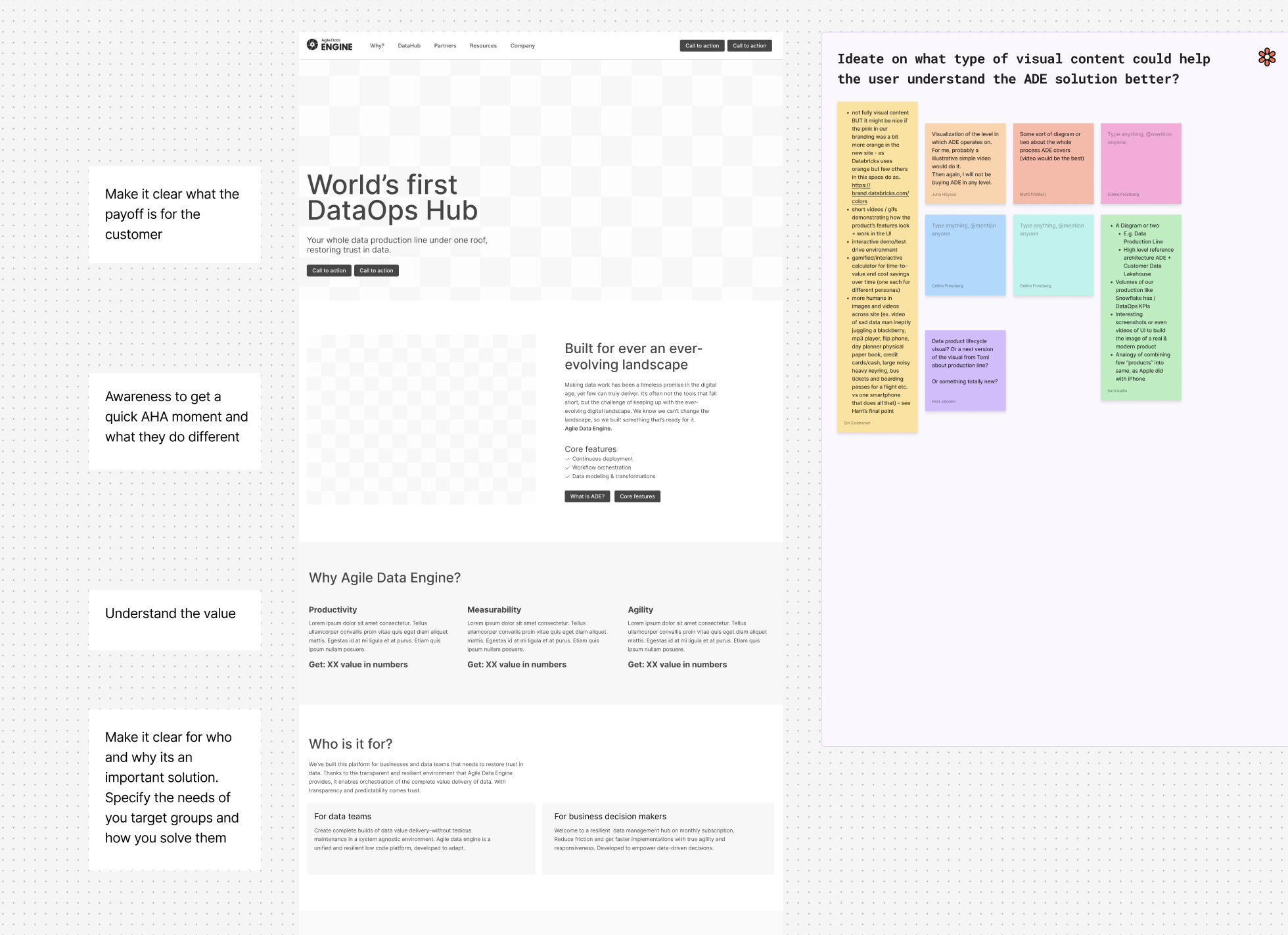
Building a design system to help Agile Data Engine achieve a streamlined vision and clear brand assets. But also identify the sitestructure and hierarchy of the website, and having a workshop together with Agile Data Engine to gain understanding in what type of visuals could help to communicate their business and the value for the customers. A three day workshop was executed in Finland in their office.
Brand
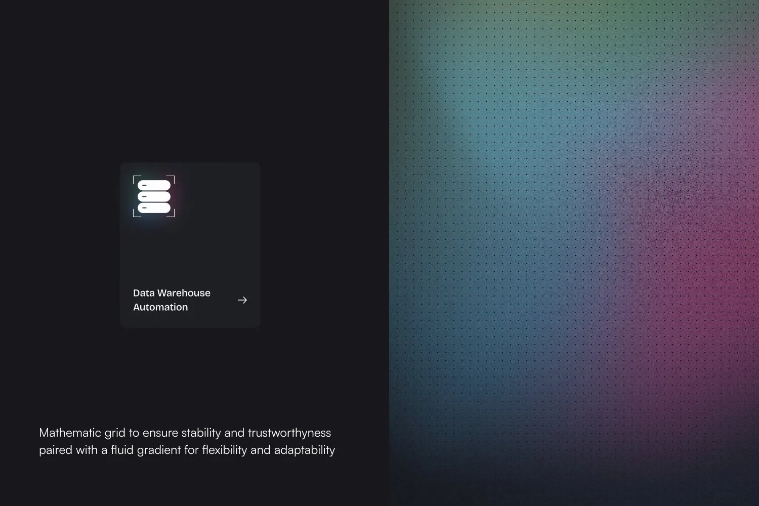
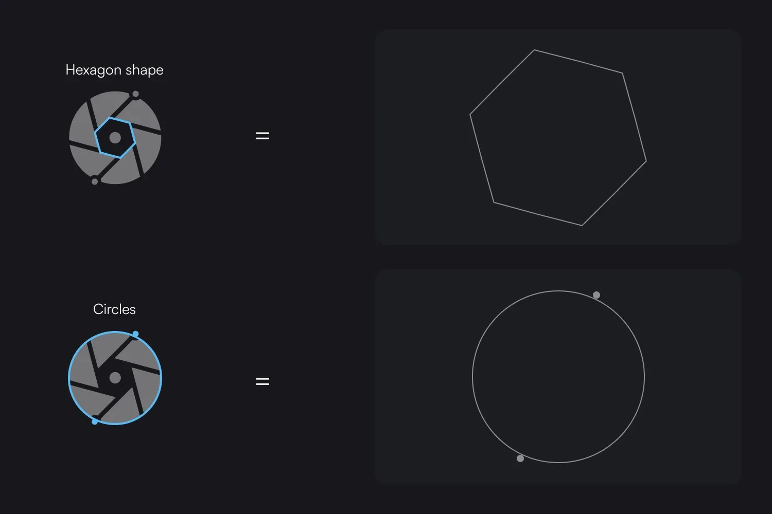
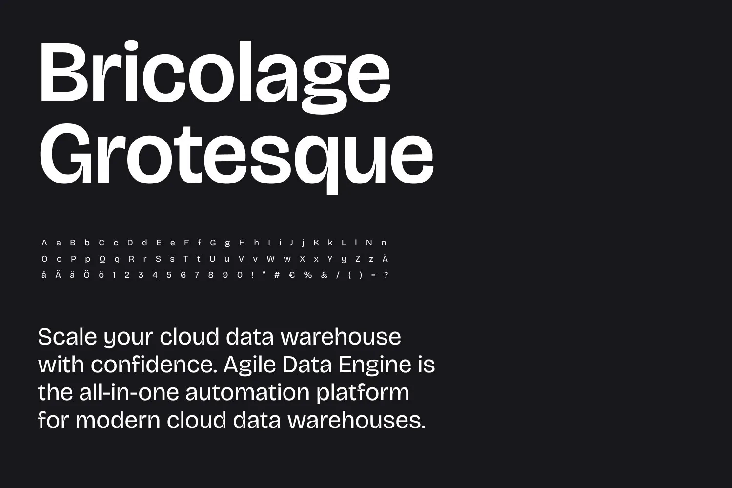
We contributed by adding personality to typography and graphic elements while maintaining the core of the brand being precision, stability and adaptability always providing real measurable data. We wanted to clearly distinguish from other competitors. A mathematical dot grid became a new graphic element in the identity, a visual way to show the precision behind the platform, and circles were added to illustrate how data flows through it.
Website & design system
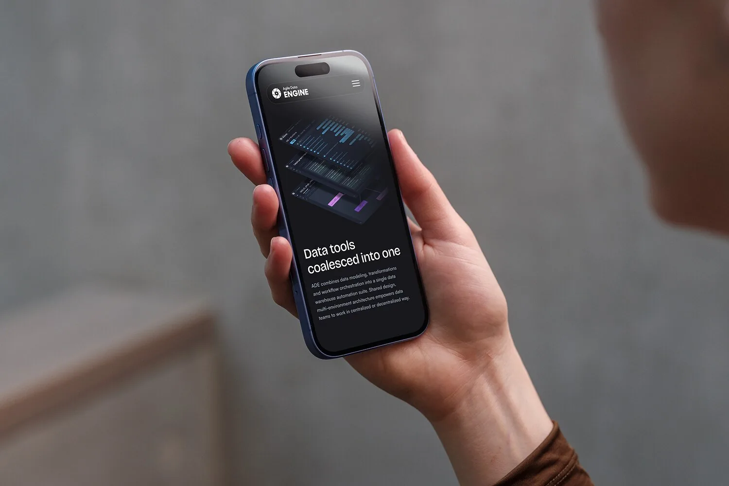
Aside from the brand update the major project consisted of designing a full design system for the web to continue updating the website. It included guidelines on new ways to implement graphic elements and ways to visualize information to achieve a clear AHA-moment for a visitor on the website. A new clear structure to find the most valuable pages for each target audience based on prior research.