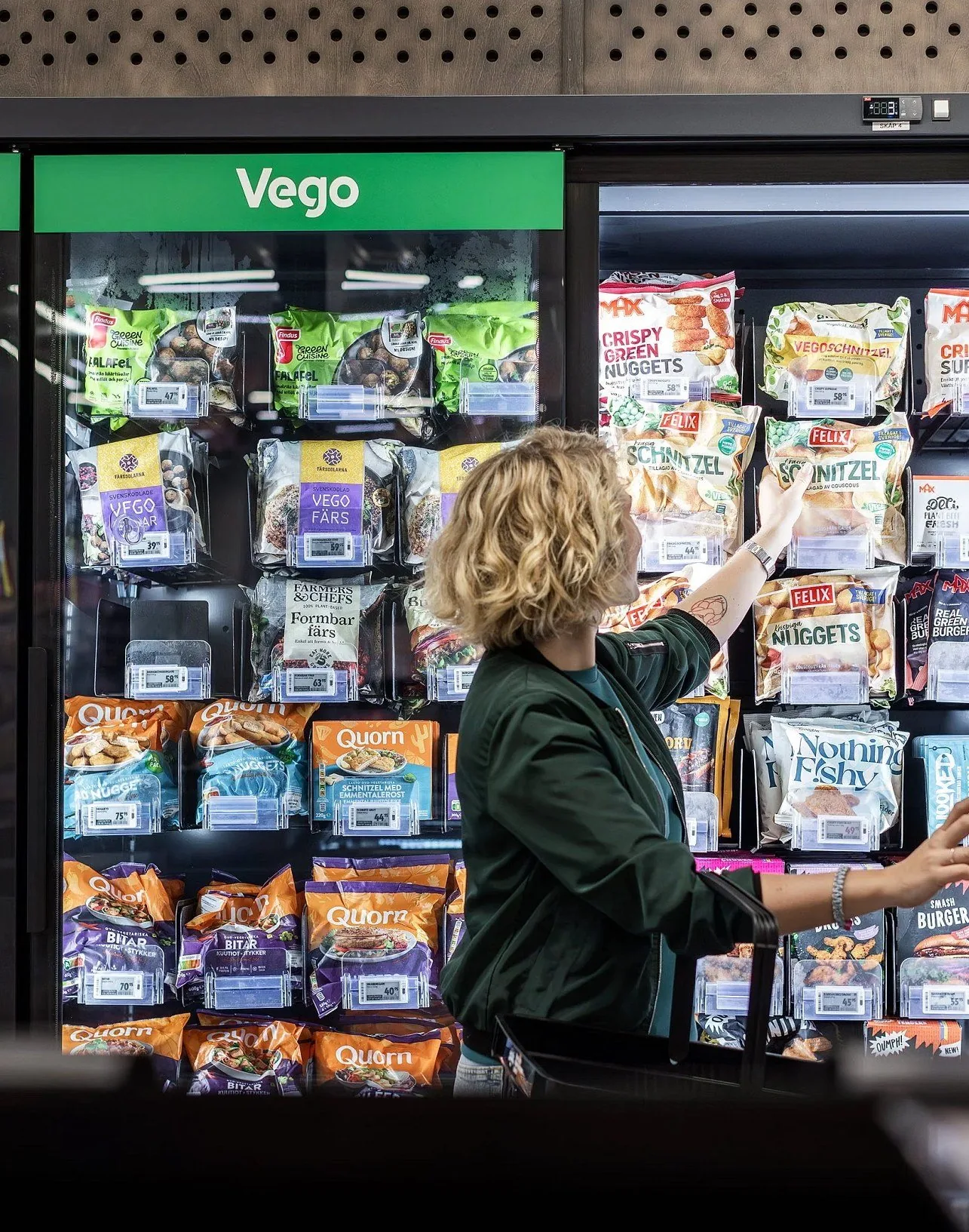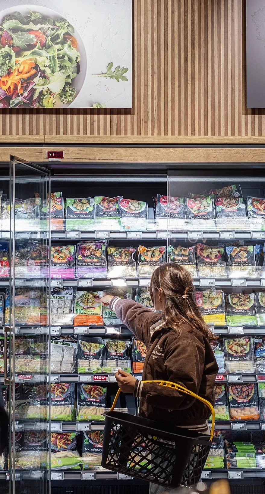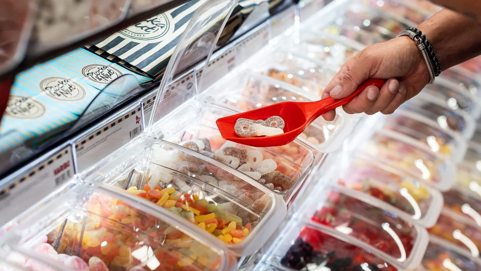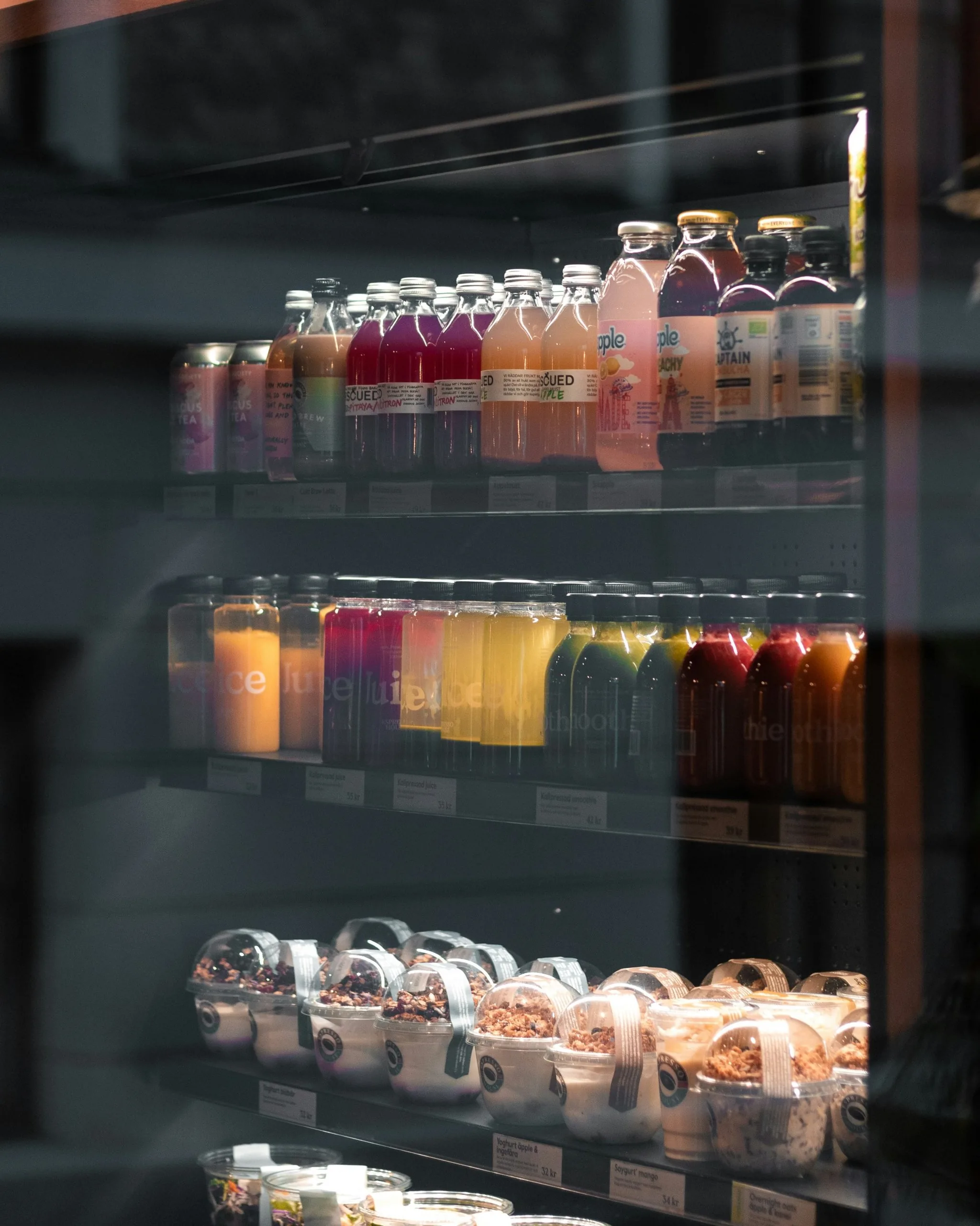
HL Display creates in-store solutions that help retailers and brands present their products better, from shelf dividers to electronic shelf labels. Their website had to serve very different buyers, from a brand owner looking for inspiration to a central buyer re-ordering on contract. My job was to map how they actually buy, and turn it into a structure for the new website.
The starting point
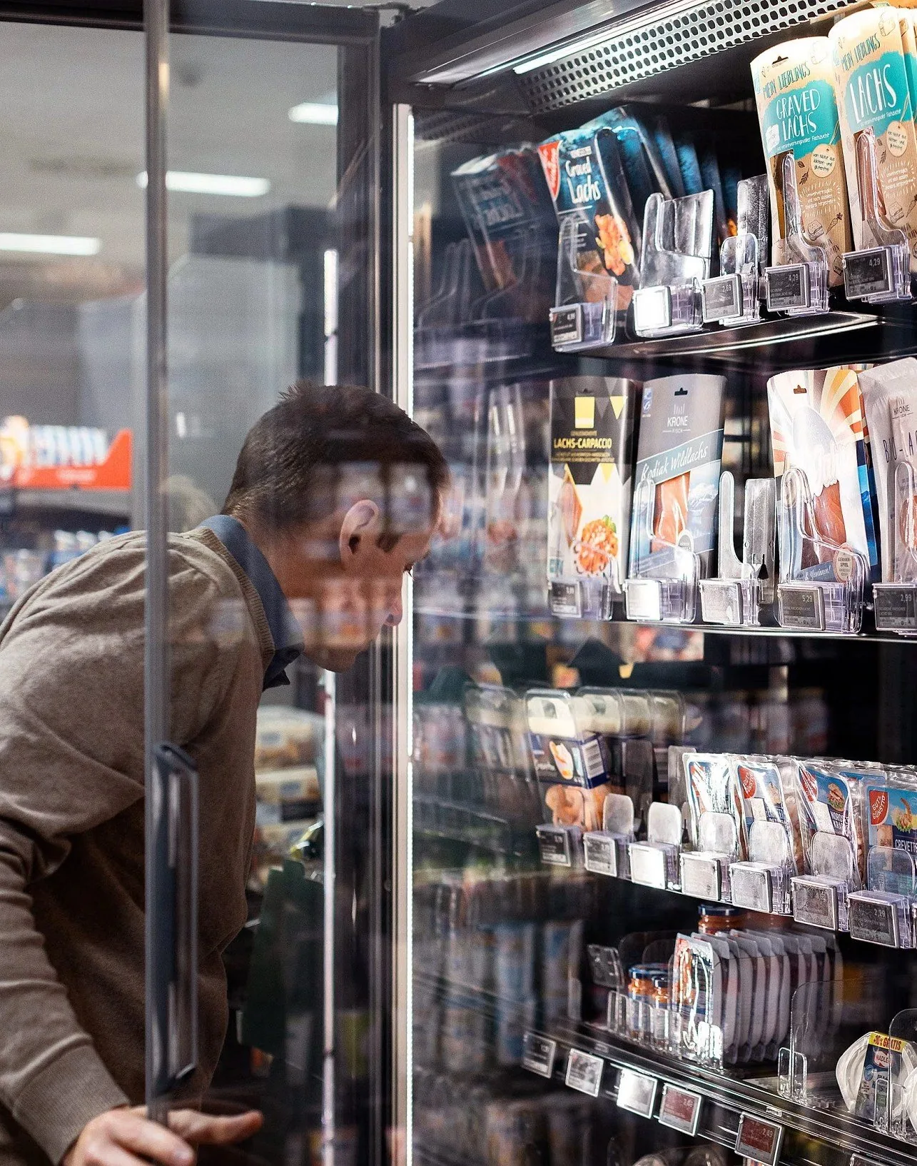
One generic journey for everyone.
Every customer segment, from small retailers to key account buyers, was pushed through the same browsing journey. The web catalogue drove most of the traffic, but it only worked if you already knew the exact item code. Inspiration and customer cases, which buyers kept asking for, were hidden in a dropdown menu and seldom visited.
Workshop voices
I ran workshops with people from sales, marketing and customer service across HL Display’s markets, to understand what their customers are trying to get done and where the website stands in the way.
The customer wants to solve a problem, either save time or increase sales.
We should place ourselves in the customer’s shoes and not present the products from HL’s point of view.
Because our product names are highly technical, customers often rely more on visuals than on product descriptions.
Two kinds of buyers, two tracks
01 The public fast-track
02 The private fast-track
Brands and smaller retailers come for inspiration. They want to see real store examples, filter by what they sell and quickly put together a quote request.
Key account buyers already know what they need. They want their portal, their contract prices and a fast way to re-order, without browsing.
So the open website leads with inspiration, filtering by store area and a simple quote flow, with the contact option following the visitor everywhere.
So the portal is always one click away. A sign-in in the header asks for a work email and routes registered accounts straight to their pre-negotiated portal.
The customer journey matrix
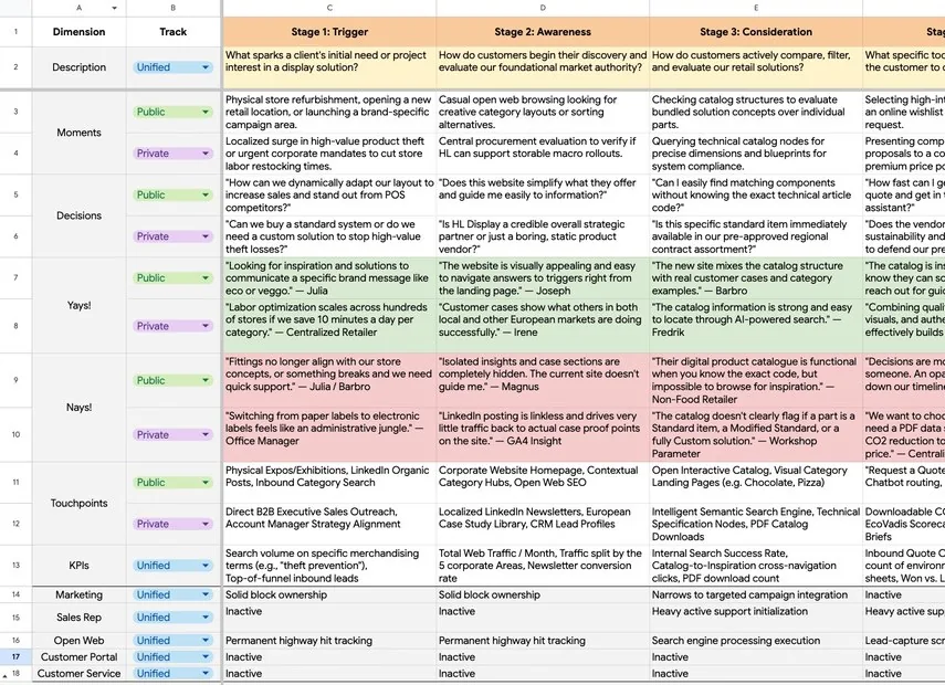
The team I was part of mapped the journey across seven stages, from trigger to advocacy, with a public and a private row for every stage. The matrix tracks moments, decisions, what customers love and what frustrates them, touchpoints, KPIs and which team owns each step. It became the logic that the sitemap was built on.
Structural decisions
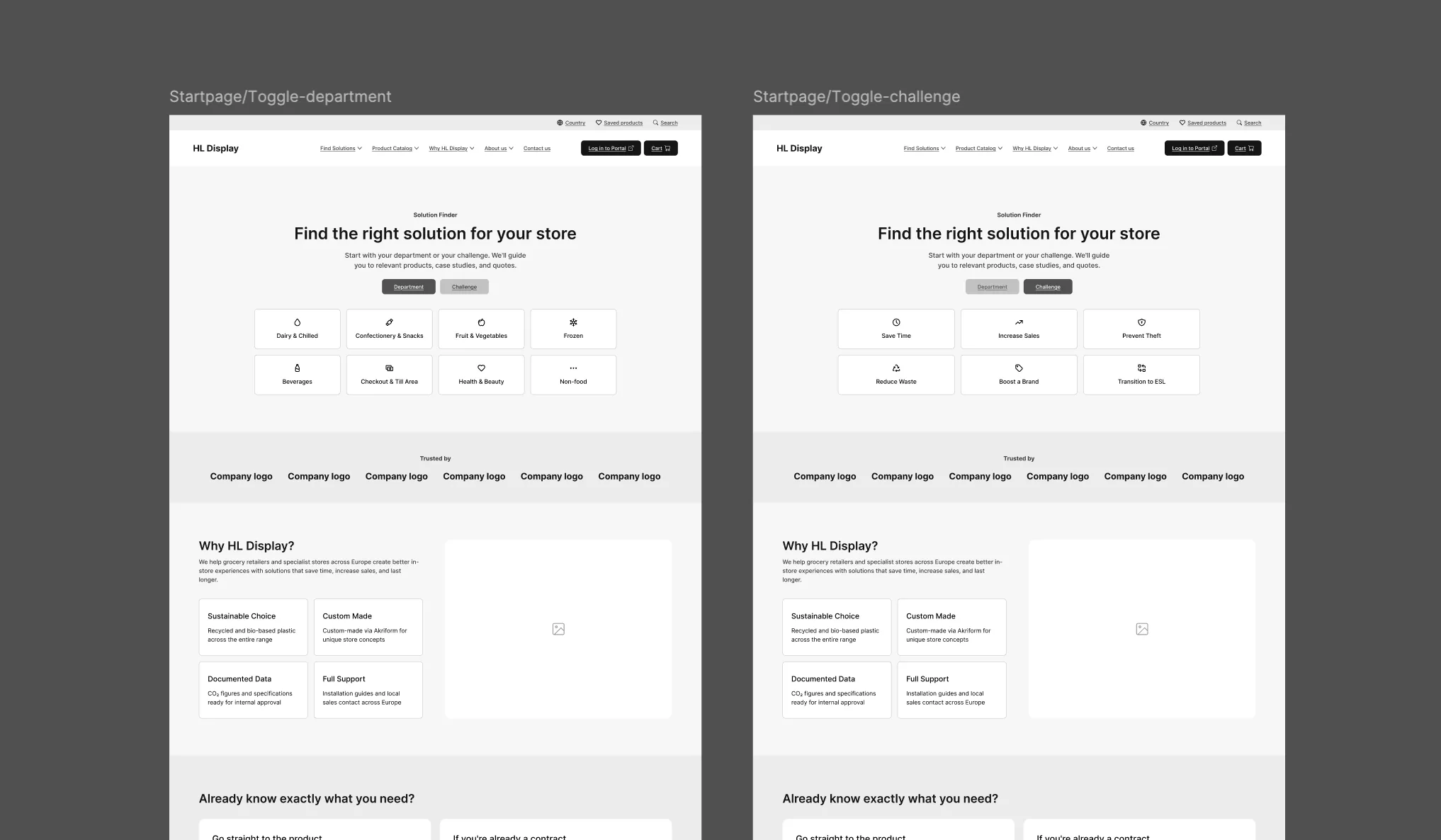
- 01 Enter by department or challenge The homepage lets visitors start from a store area or from the problem they want to solve, like theft prevention or saving staff time, instead of asking them which customer segment they belong to.
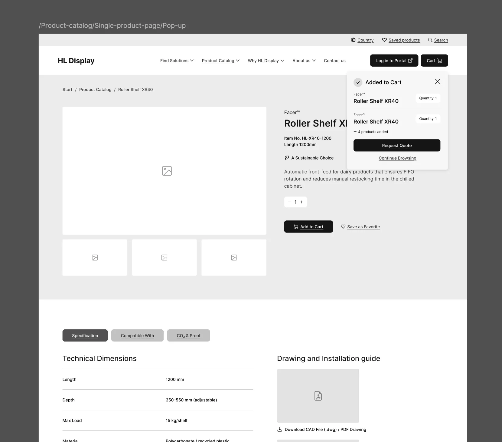
- 02 One product page with everything The isolated inspiration section is removed. Specifications, in-store inspiration, compatible components and sustainability proof all live as tabs on the product page.
- 03 A smart route to the portal The website and the ordering portals run on separate platforms. One entry point in the header bridges them, so key accounts never have to search for their portal.
Sitemap & wireframes
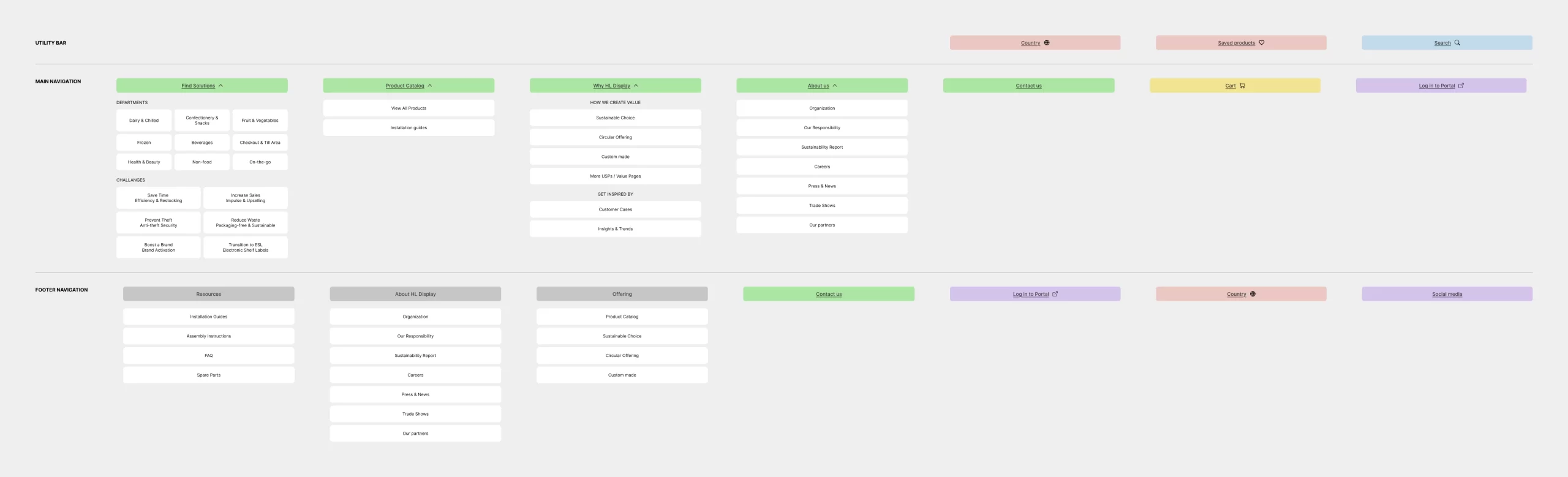
The journey matrix was translated into four functional clusters and a sitemap, followed by wireframes for the key pages and flows.
Delivery
The customer journey matrix, the sitemap, UX flows and wireframes were handed over as the foundation for the new website, and for the next phase of content and design.